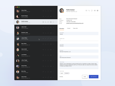
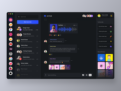
Client selection
This is a client selection for a financial institute application. For me, the best use of hierarchy is mixing dark and light themes - I don't believe in the light/dark theme switcher. I think it's about finding balance.
This design also uses aa 'master detail' interaction pattern (Like Microsoft's master detail pattern documented very well here
https://docs.microsoft.com/en-us/windows/uwp/design/controls-and-patterns/master-details.
More by Lailla View profile
Like

