Accessible Color in UI Design
First part of little a series of tips & examples on how to easily make your designs more accessible, inspired by w3c's accessible design training.
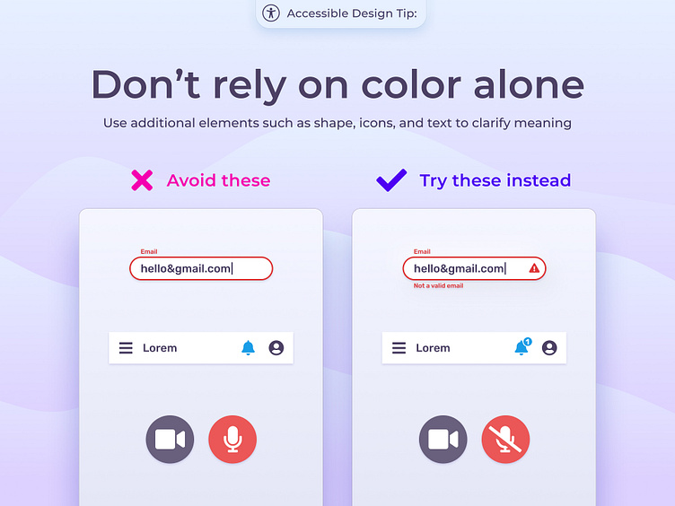
In your designs, use elements like text, icons, and shape in addition to color to clarify meaning and make your designs more accessible.
This is important for people who are colorblind, have low vision, or people with a cognitive or learning disability who use a grayscale display to focus their attention. Using text or well-labelled icons will also assist people who navigate using a screen reader.
You can easily test your designs by putting a default grey rectangle with the "color" blend mode over your designs, to test if they are readable without relying on hue!