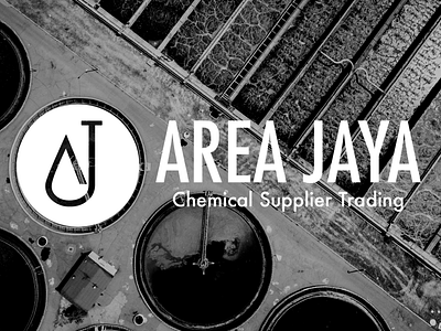
Branding for AREA JAYA
A logo that symbolizes the factory wastewater treatment.
The brand icon is made from AREA JAYA's initials, AJ.
Inspired by specialization in the field of wastewater treatment plants which aims to make all kinds of factories in Indonesia have waste that is environmentally friendly and not harmful to the environment.
By combining the letters A and J in a circle, this makes the brand seem more welcoming and inviting as the mission of this brand. This circle icon also makes it easy to be placed on various social media profiles.
The blue color was also chosen because this color tends to be neutral for men and women. Because blue also has sincerity, it is suitable for this brand that offers professionalism as well as a reliable support system. Typography also makes the brand feel modern & simple.
