Der Belgier

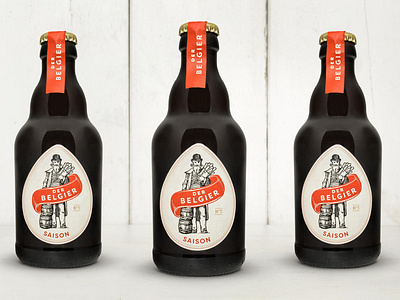
RAF TOTÉ started brewing beer out of nostalgia for his home country Belgium. After researching a name for his label we came back to the one everyone in the small Viennese craftbeer scene has already been using for him: the Belgian. It was clear that we wanted to play with his Belgian background while creating an elegant, premium packaging design. The heart of the design should be THE Belgian: charismatic, elegant but with a funny twist: wearing Magritte’s hat, Poirot`s moustache, and a paper bag with giant Belgian fries.
www.graphicsociety.at/graphic-design/belgier
www.derbelgier.at
Photos: Johanna Riedler