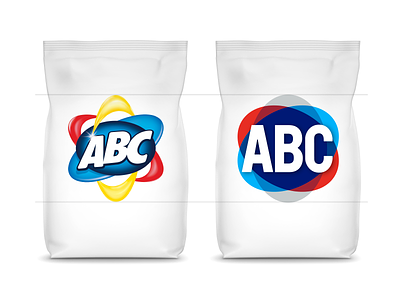
Better legibility & readability in the same size
The biggest problem of the previous logo; No matter how big the logotype is used on the product, letters were small compared to other competing brand logos. (because of its complex construction and letterforms.)
That's why we developed the new typography that can be used bigger in the same size.
Full Project at Behance: https://www.behance.net/gallery/98549421/ABC-Detergent-Rebranding
More by Mehmet Gozetlik View profile
Like
