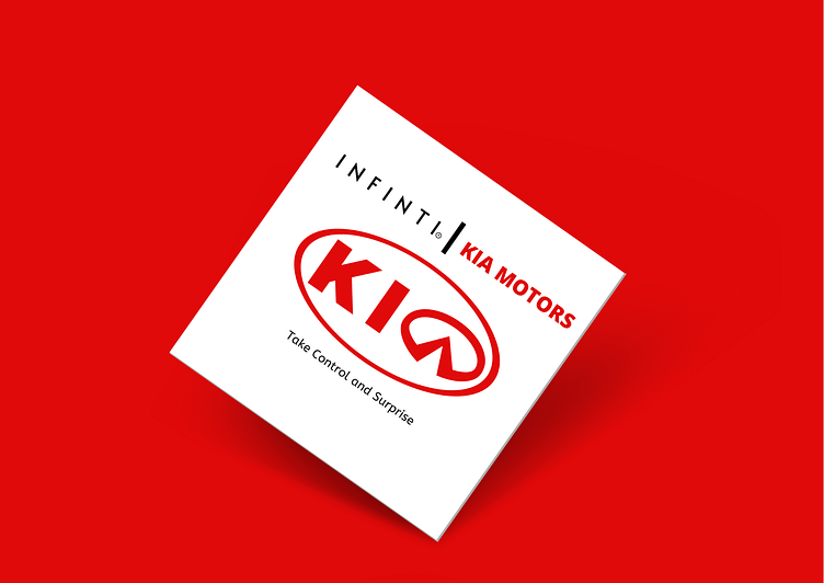
KIA and INFINITY Logo Mix
The Story behind the Logo:
KIA- The current emblem of Kia is very simplistic, featuring the company’s name placed on red Background, embedded into the silver oval. However, the KIA logo has a specific feature that makes it particularly recognizable: the A letter misses the horizontal bar. The corporate colors of Kia Motors are red and white. However, this palette was only adopted in the 1990s. White color is said to be representing purity, elegance and transparency towards the clients, while red exposes the brand’s determination in rapid development and makes part of the company’s slogan ‘The Power to Surprise’.
INFINITI - Infiniti logo symbolizes a special approach established by the new brand which is based on luxury, performance and aspiring for new horizons and edges of automotive industry. The logo is based on traditional infinite sign which is well-known to everyone. Designers decided to use it as a base for the car badge as it reflected the inner spirit of every vehicle produced under Infiniti name.
The numeral 8 which is lying on its side introduces physical representation of infinity. It is an ancient symbol believed to have appeared at the beginning of human civilization. It turned sharper on the brand logo and was embedded into a silver oval, making it look stylish and modern. It symbolizes the elegance of every detail along with luxury, great performance and the search of new horizons in automotive industry.
I had to create a logo which combined the purity and simplicity of Kia and the elegance and luxury of Infiniti.
The simplicity of kia was shown by the simple logo containing the name inside an elliptical circle. So I took that as a base for my design because you can add luxury to simple, not the other way round. The peak in the Infinti logo resembles alphabet ‘A’, So I used the whole logo instead of ‘A’ letter in Kia logo. it. The new logo has the qualities of both the logos - simplicity, transparency, perfomance and luxury.
Feedbacks are appreciated. Let's connect :
