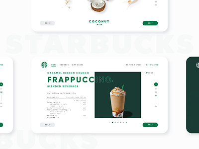
Starbucks - UI/UX Redesign
This a concept from late last year for a redesign of the website of Starbucks.
After being on the Starbucks website and seeing that it could be much better, I decided to give it a fresh air, modern, elegant and usable.
Thanks for checking it out, hoping you’re all keeping safe, healthy and positive.
3/4
https://www.behance.net/moisez
https://www.instagram.com/iammoisez/
More by Moises Solorzano View profile
Like
