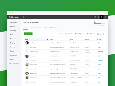
QuickBooks Online — User Management I
Hello Dribbblers!
I'm happy to share with you more of the design work that went into rethinking and creating a new User Management experience for QuickBooks Online.
As small businesses grow and evolve, it becomes paramount to manage user roles and permissions efficiently to give users only the access needed for their role. In this shot, I want to showcase two design directions my team and I ended up undertaking and then polished during the design process, in order to help small business owners manage user access in QuickBooks Online, so they could give users only the access needed to thrive in their role.
For context: QuickBooks user roles are customizable permissions you can give your employees and contractors. User roles are either billable or non-billable. Billable users count toward your user limit, while non-billable users don’t.
First Approach
The first three designs illustrate what I like to call a "traditional" approach to solving the User Management problem. When you add a user in QuickBooks Online, you can manage their roles and limit their access to specific tasks. You can also choose what users can see and do within different areas of QuickBooks, like customers and sales, or vendors and purchases. This design features a preview mode that lets you see your custom roles from the perspective of the user before you assign them.
In essence, this solution ensures that businesses can effortlessly scale while maintaining control over their data access. It harmonizes two critical aspects: safeguarding sensitive information and providing streamlined user management, all wrapped up in the signature design system of QuickBooks Online. But it's not just about the aesthetics. Beneath the sleek exterior lies a robust system equipped with smart filters, easy search functionalities, and a real-time access update mechanism. Whether you're adding a new accountant to the team or ensuring that department-specific staff have limited access, the User Management module for QuickBooks Online has got you covered.
Second Approach
The last three designs show a sneak peek to a different approach based on a Workforce model, meticulously crafted for today's dynamic workforce.
Elegantly structured, each worker's profile is organized into streamlined tabbed sections—providing instant access to Worker Details, Pay-slips, Documents and Permissions. But where it truly shines is the flexibility it offers administrators. Within the 'Permissions' tab, not only can admins swiftly assign predefined access levels, but they're also empowered to tailor permissions on-the-fly, and even conduct audits of activity taken within the system. Whether it's granting a unique data access request or fine-tuning permissions, customizing a granular access level is a breeze.
In essence, this approach prioritizes both user-centricity and robust security, ensuring that managing a modern workforce is both intuitive and ironclad. Moreover, the design embodies QuickBooks' commitment to a seamless user experience, ensuring that the navigation remains intuitive, regardless of the intricacies of workforce management and user permissions.
Feel free to leave a comment to share your thoughts, and press 'L' if you're loving the shot.


