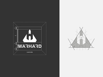
WarHard Logo Design
This identity system is based on the initial WarHard, the letters W and H. I took the concept of negative space at that time and decided to make something deeper and more interesting. and when researching names, I want them to be abstract and phonetically sharp.
Because the product issued by Warhard is actually to provide comfort and protection for athletes in extreme sports and is used for young customers, therefore this logo must look strong and modern.
see the newest site, incredible brand image changes
https://www.warhard.co/
More by Luthfan Mazida View profile
Like
