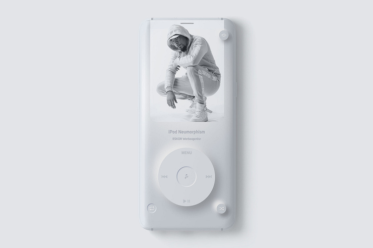
musicplayer neumorphism design
I found my old iPod classic today. Both inspired me to create this minimalist Neumorphism design.
Which style do you prefer 1st or 2nd?
Under the term "neumorphism" or "new skeuomorphism" a new trend is starting to bring this abstract representation back a little closer to reality.
Instead of the floating cards and other UI elements, we assume that we create the elements from a single solid material together with the background. We virtually emboss elements into or out of the material. This creates a homogeneous user interface that still looks structured.
What do you think about neumorphism?
More by ESKOR Werbeagentur View profile
Like
