DailyUI #040 - Recipe
Good' evening Dribbblers 👋
This is my #040 #DailyUI design. 🧁🧁🧁
Design Hint 💻No design hint today, again... I'd assume just design something to do with recipes.
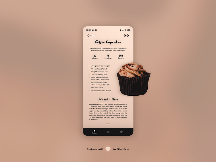
The Idea 💡 The idea for today’s UI design is a recipe page for a mobile recipe app for Android and iOS. The page will be informatic, with all the necessary data needed to cook/bake an item, including the ingredients, methods and short snippets of interesting info. The design will feature a duo mix of type fonts, brown gradient colour palettes and an overall layout heavily inspired by my #36 DailyUI I designed last Friday.
Final Thoughts 🧠 It's informational, clean and tasty-looking. It's what I set out to achieve today, and I think it looks pretty neat! Pulling inspiration from one of my previous DailyUIs, I experimented with a few other layouts, but I found out the way I had the image laid out in the UI I had designed for my #36 DailyUI would of worked flawlessly for this UI too; so I based this one from that. The image for today's UI is once again a photo turned vectored with the help of Illustrator and some patience, the original photo credits are below.
The short snippets of information located towards the top of screen, under the title of the recipe are there so that the user can take a glance and see vital information about the selected recipe such as, the time it takes to prep and cook, how many servings a recipe makes and the amount of calories per serving. The user can also glance to the top-right of the screen to view if a recipe is vegetarian or vegan, further enhancing the overall amount of information available at the user's fingertips. The ingredients are simply listed in the centre of the screen for easy viewing, and are further enhanced for legibility by the use of 'bullet points'.
The methods of a recipe are shown in stages; so say you have a cupcake recipe, the method for the 'base/sponge' of the cupcake would be shown, then you would need to swipe right for the 'icing' stage, all while being indicated via the two (how many stages) 'carousel' circles nearer the bottom of the screen. A navbar also occupies the bottom of the screen, allowing for a 'global' app navigation.
This makes for 90% (10% being the top-left back button) of interactions to be located nearer the bottom of the screen, allowing for the best possible UX - through the most common finger placement and also one-handed device operation.
Overall, its been a chilled-out and fun day of designing, again. I'm really glad to of gone and looked back through all my previous designs because I really think today's UI benefitted from the inspiration gained from them. I like cupcakes and I certainly like what I have achieved today; I'm feeling hungry again!!! 🧁
Unsplash photo credits 📷 @jacobboavista
Share the love, press "L" or "F" if you ❤️ my work!
As always, I welcome any feedback! 😄
- Elliot
