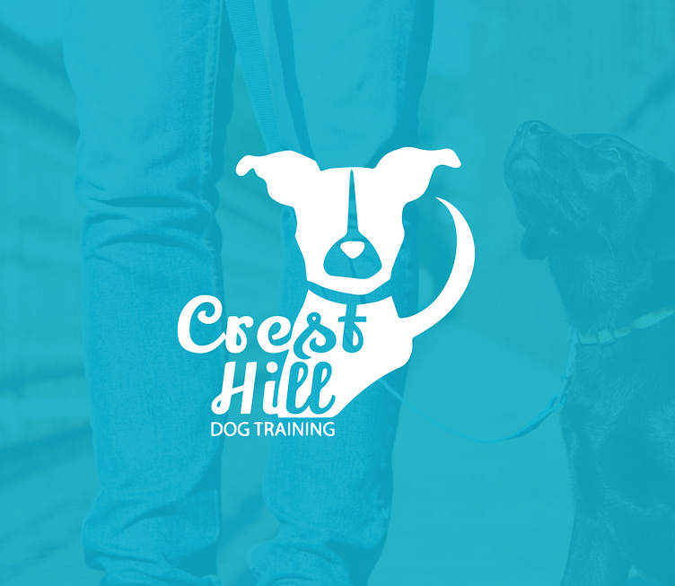
Crest Hill Dog Training Logo
I knew that the logo needed a dog, but the challenge of this project was how to present the icon with the name in a simple way. I came to the conclusion to use negative space to help incorporate the name with the shape of the dog. The owner was confused as to why the dog didn't have eyes or a mouth and I explained that simplicity is key in the design, and take away features that aren't necessarily needed.
More by Waffle Grafix View profile
Like
