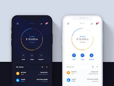
Infinity Wallet Mobile themes
We all know those moments when you are in the dark or part-sleepy and you open up your phone to get immediately blasted by its brightness. 🎇
Whether you want to reduce eye strain, improve battery life, or it just has aesthetic appeal, dark mode is a perfect solution for that 🌚
But among all these reasons there's one more strategic when it comes to using dark mode 🤔🤔
Why Infinity Wallet uses Dark interface(on default, at least)?
People often think of Dark Mode as a choice between a black or white screen, but this feature involves a wider spectrum of grayscale and color gradients. 🎨
If we take look on Spotify - darkness is a key part of its design. Spotify wanted to emphasize the music, the artwork, photographs, and important navigation buttons.
And, since Infinity Wallet lets users manage multiple of their assets in one place - and every Cryptocurrency has not only it's own logo but also it's own color-coding - it's important to quickly filter out the coins you're looking for. Dark mode emphasizes these colors, making each asset in your wallet easy to spot and differentiate among others. Be it transaction history or simply your wallet content - you will never mistake one Asset for other thanks to the dark mode.
