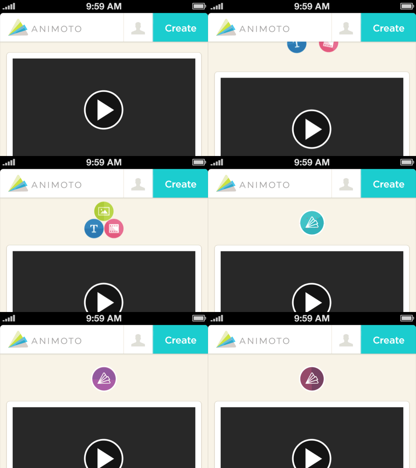
Animoto - iOS Pull-to-Refresh
This was a collaboration with @Gordon Mei and @josh lambert on a pull-to-refresh interaction for Animoto's iOS app.
After a lengthy brainstorm session, we all agreed on what should happen: the three icons within the circles (that represent the three aspects of Animoto’s process, image + text + video = Animoto), are pulled together by the user when they would like to refresh the page, and instead of a regular spinner, you get a little interactive lesson in Animoto’s process. We wanted to convey the idea that when you combine these three ingredients, Animoto does it’s thing and churns out the dopeness (hence the colour shards behind the logo, spin around, as if to say that Animoto is hard at work. Like a washing machine cleaning your duds).
The process was actually quite unique and new to me, whose background is in broadcast design, learning the ropes on interaction design for mobile. For example, how many frames is this? (60 fps) What is the final canvas size? (640 x 250) How do I deliver this to the devs? (png sequences!)
The conversations with the devs where insightful and interesting and have led to more motion “mock ups,” or specs that show how the motion should behave when in use. Then in most cases the devs rebuild what I design to move. @Gordon Mei is my friend. Thanks yo.
