The Gathering
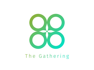
Logo created for a Columbus, Indiana based young adult collective from several churches in the city. When founded, it was originally led by four leaders of major churches in the area, leading to the "Four Dots" logo it began with.
Expanding on the original logo, which was comprised of four green dots with the top left one being a warmer hue, I formed the dots into thought/speech bubbles to show the group's focus on discussion and discourse when teaching. The four circles each have a different hue (or viewpoint), yet all come from the same source at the center (their faith). At the center, the white space forms the shape of a cross when surrounded by the four circles.
The green gradient includes warmer and cooler hues, and can be both energizing and full of action while also refreshing and soothing.

