Cleveland Guardians Wordmark
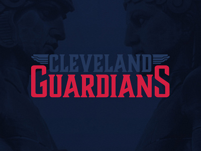
The guardian statues are done in an art deco style, which I adore, but wasn’t going to work too well for a sports team. It needed to feel appropriate in style and be timely, while also being sporty and timeless.
I wanted it to connect to the style of the statues without feeling out of place on the field. The typeface I chose reminded me of the actual guardian statues: tall, stable and strong while having a modern, cutting edge to it.
I then stacked the text and added the guardian wings to flank the top portion, which anchors it all together rather nicely. Overall, I’m very pleased with the final design. Hopefully this feels as iconic, strong and timeless as the guardians that tower over our city.
On guard!
