DailyUI #039 - Testimonials
Good' evening Dribbblers 👋
This is my #039 #DailyUI design. ⚗️⚗️⚗️
Design Hint 💻No design hint today... I'd assume just design something to do with testimonials.
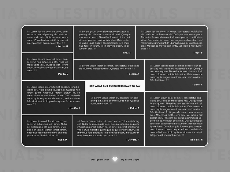
The Idea 💡 The idea for today’s UI design is a testimonial section for a unspecified theoretical website. Once the user has scrolled down enough to the testimonial part of the page, a section full of testimonies would fill the screen, it would be text heavy, but it would give a lot of space to show a number of testimonies. The plan with the design is to really focus on getting the margin and spacing correct to a T, along with trying to make the website section as abstract as possible while keeping it clean and simple enough to read. The design will feature bold abstract lines, along with a clean and modern Black and White colour palette.
Final Thoughts 🧠 It's weird, it's spaced and it's oddly satisfying??? Haha! Today's DailyUI was more of an experiment of sorts, I didn't want to just design one single testimony, so I decided to design something abstract, instead.
The entire design is based from abstract art in the real world, think of those 'square and rectangle' pieces of abstract art. I've actually painted some of that nature (albeit more simplified versions) and that is what had me on this DailyUI, bringing what I had painted into a digital space of sorts. This type of design formation was perfect for testimonials, it allowed for a varied number of them, and for them to be displayed in a unique and wonderful way.
The text was the major focus alongside the margin/spacing of said text. It was simple, just have a simple sentence stating "See what our customers have to say" with all the testimonies (Lorem Ipsum 'filler' text in this case) scattered abstractly around that; it worked like a charm. Now, with the margin/spacing between each line and each text box was the time consuming part of the day. Since I was working in Adobe XD, I was stuck with either a left, center and right alignment for the text, because for some reason they still haven't included justification (I know there's this justifiable (pun not intended) argument Peter states in this Adobe conversation, but hey, I like my justify-ness haha).
I tried a left aligned text but something just wasn't sitting with me, so I ended up booting up Illustrator and typing the text box (with the correct spaced out dimensions) in that software, justify aligning it, converting the text into a vector and copy and pasting it across to XD - It's definitely not a pretty workaround, nor an efficient one (I had to do this for all 11 testimony's), but it worked for what I wanted to put across in my design; can't argue with that. Now with the beautiful justification, along with the 35px margin/spacing around the text, it looked great! I had completed my abstract testimonial design.
Overall, it's been a fun and chilled out day designing my experimentational testimonial website section! I've problem-solved to a degree (albeit a pretty dodgy degree) and I've produced something I like, so yeah it's gone pretty well!
Share the love, press "L" or "F" if you ❤️ my work!
As always, I welcome any feedback! 😄
- Elliot