Copees Logo - Creative Studio - Chennai - Branding 03
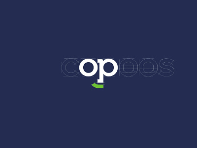
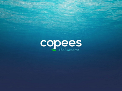
Self Identity for Copee's Creative Studio — branding agency in Chennai. This project requires an in-depth understanding of yourself as a creative person. It is an exploration of who we are and who we want to become in this creative world. It is a channel for me to express our creativity, and to showcase our design thinking and skills that we have accumulated over my education and work experience. This publication displays our skills, and the meticulous details that we take into consideration when creating a logo and layouts for each page of our publication. The font symbolizes a touch of personalisation and versatility, the sans serif font symbolizes the modern, bold, and structured look and feel that we uphold throughout our design works. The letter “o&p” symbolizes the smart face. It is a representation of how we would look at things through different angles, and how we would always inject my quirk and style
https://www.behance.net/gallery/78632773/Copees-Complete-Branding-for-Advertisement-Agency