Custom Bottle Design, Overtone
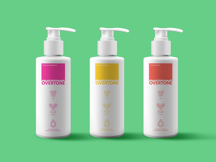
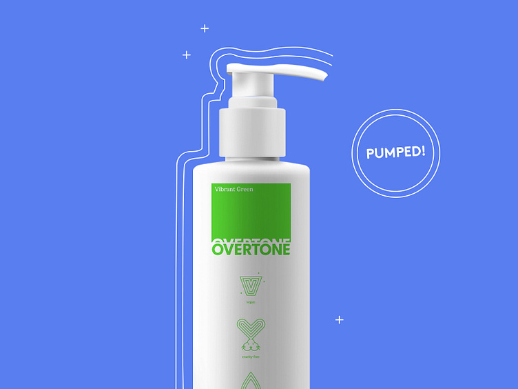
A big part of my Overtone Color spec project was giving the product packaging a full makeover. The look of the upgraded packaging is inspired by the King of Color; Pantone, with it's swatch-based aesthetic. It also features key differentiators of the brand in the form of icons so a user can immediately tell what makes Overtone so wonderful. 🌈 Instead of the current squeeze bottle, we went with a pump. The pump enhances the user experience by making it easier to get every last drop of color without excessive shaking, and only requires a single hand instead of two. 👌 . . Check out the full design study at ds.link/overtone