DailyUI #037 - Weather
Good' evening Dribbblers 👋
This is my #037 #DailyUI design. 🌦️☂️🌈
Design Hint 💻 Design something related to weather. It could be a UI for a mobile app a web app, or something completely different such as a weather alert widget. Consider its elements: city, temperature, forecasts, colors, weather icons/graphics, etc.
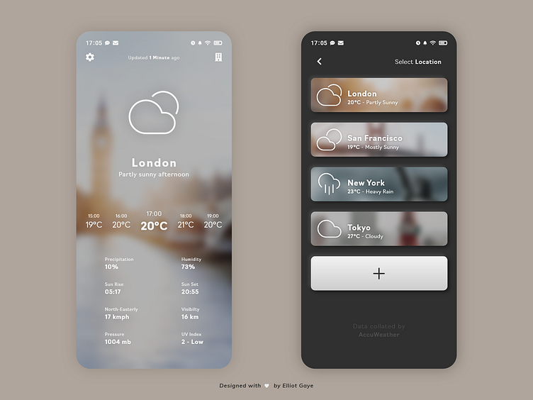
The Idea 💡 The idea for today’s UI design is a weather app for Android and iOS. The app will feature various sets of information related to the weather, such as precipitation, humidity and wind etc. while also featuring a 'location select' screen. The design will be prominently clean and minimal with a White primary colour and a background made up of the selected location. A secondary dark Grey colour would complete a 'dark theme' within the 'location select' screen, for easy usability at anytime of the day. The design will also feature some neurmorphism and shadow throughout.
Final Thoughts 🧠 It's minimal, it's modern, it' informational and it's aesthetic; I love it! The blurred dynamically-changing 'locational' background really makes the design pop, with the White UI elements sat comfortably above. The background would dynamically change to fit the current weather in that city (e.g. currently it's a sunny background of London, since its partly sunny there).
I focused primarily on the layout for this DailyUI, since with a solid layout of elements on a mobile screen, it can make or break an entire app. I designed the 'weather' screen [LEFT] in a way so that the end user could glance at the top of the screen and see what the current weather is very efficiently (with the use of large iconography), while scanning further down collecting more sophisticated information. Basically, the information becomes more advanced the more the user looks down the screen, with simple iconography at the top and lots of informational 'number' statistics at the bottom. The end user can also swipe left/right through the 'hourly' feature located in the centre of the UI, which would update the advanced statistics underneath and the iconography above.
The 'location select' [RIGHT] screen features a 'card' design to make for an easy and enjoyable UX, with information in each card essentially being a simplified set of current statistics from the 'weather' screen [LEFT] so that the user can glance at each city and choose to progress further on. The background of the cards are also the same blurred dynamically-changing image of what is situated within a city's 'weather' screen [LEFT]. The cards feature some neurmorphism around them too, to make them pop and stand out within the screen more.
Overall, it's been a fun and interesting day of designing my weather app, and coming up with that solid layout. It's a weather app that shows the current weather among other statistics, while looking aesthetically pleasing. I love what I've designed this afternoon!
Unsplash photo credits 📷 @hmiguelsousa, @pezza3434, @juliusdrost, @thetalkinglens
Share the love, press "L" or "F" if you ❤️ my work!
As always, I welcome any feedback! 😄
- Elliot
