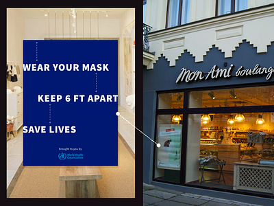
UI Challenge 05 - COVID Content Strategy
This was a special UI Challenge that asks us, digital screen designers, to think "outside the box". If you had limited space to practice UX principles on something that's very applicable right now, how would you go about doing it?
This challenge asks to practice the following principles:
Hick's Law
Miller's Law
Von Restorff Effect
I choose to practice in a poster that could be put up in front of stores, could also be used by hospitals. Just any enclosed space that needs reminding the person walking in of simple steps to help keep us all safe.
Inspired by my own experience walking into a hospital, having to stop in front of the sliding doors just to read an 8 x 11 piece of paper. When I only have a couple of seconds between seeing the message and passing it.
My design is meant to be big and easy to consume in a few seconds. Simple and lasting in its message.
