Clinician's Incubator Brand Identity
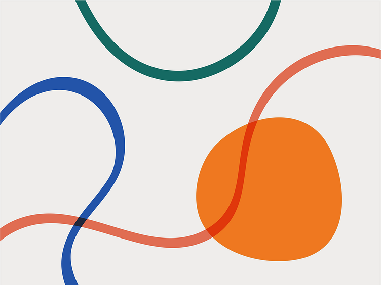


The concept for this identity was based around a system of visual metaphors. The sunny egg yolk at the heart of the logo and identity represents nutritionists-in-training: the embryo. The three overlapping shapes that surround the yolk represent The Incubator. They also represent the company's three founders, their holistic approach, and their relationships with each other.
These four shapes can be pulled apart, overlapped, and rearranged to create a variety of artistic compositions for use in collateral print materials, worksheets, web graphics, and more.
I also incorporated a series of hand-drawn marker textures that could be used to add an extra layer of depth and character to brand collateral.
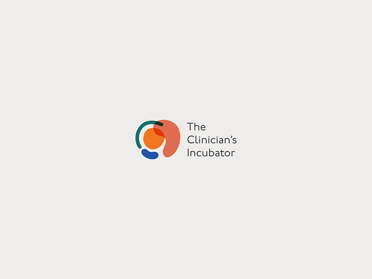