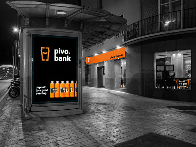
pivobank.Rebranding
Sometimes to create something new is much easier rather than to recreate. Nevertheless we accepted the challenge.
pivo.bank is a successful beer chain which has more than 60 stores. They turned to us for rebranding to correspond visually to all current trends and to consolidate their market power.
The team of our designers squared up to the task. Not to lose the recognition, we have preserved some elements of the old identity. Already familiar to the consumer beer mug turned into a modern pint with a friendly smile. The main color orange remained.
The visual system of pivo.bank reflects the dynamics and changes its shape in order to adapt to different media. That is why accent point and pint, that can transform into brackets, became the elements of brand identity. This visual solution helps to focus on various text massages.
pivo.bank also wanted to emphasize their reference to banking. That is why the fonts are strict, laconic and the developed slogans and a verbal communication.


