AURA Logo
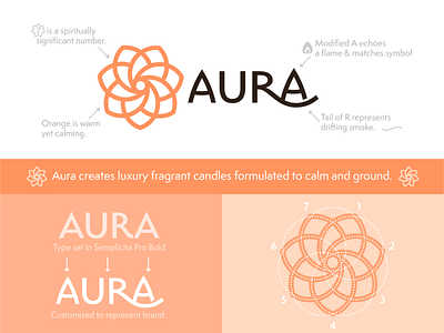
Here is a little breakdown of a recent concept I created. I set out to give the typography and the mark a great synergy, and imbue both with additional meaning and the right feeling for the brand.
Let me know what you think about this concept in the comments below, and check out the shot I rebounded this from for more on this project.
Aura seven circles-18.png
300 KB
More by Robert Nowland View profile
Like

