Boxpay logo design.
Firstly it's not an actual logo for an actual brand. It was made out of fun.
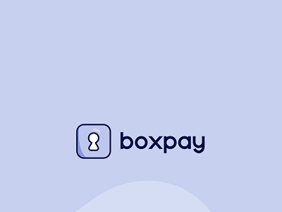
I started by sketching out ideas according to the values of the brand and i kept on getting things related to handshakes and all but then, i wanted it not have every usual icon so i settled for the keyhole icon, which describes 70% perfectly. As for the shape, i learnt in shape psychology that rounded corners and circles represent commitment and unity so i did that in the square.
The square as designers all know, stands for order, security.
Then i opened my illustrator to make the design.
