(Re)brand thoughts...Monogram showdown
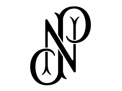


So, I'm down to these two final monograms. Not sure which one I like more. My full name could possibly be part of each monogram (underneath) or used separately as purely a typographic element for business cards, website, resume, etc.
NPA - a three-initial traditional monogram that follows the structure of using the first name initial on left, middle name initial on right, and last name initial more prominent in the center.
NP - a two-initial monogram that can be read as NP regardless of which way you turn it.
Any thoughts? Both monograms are attached in a larger size if you get too tired of looking at the gif.