Neutral & universal App icon for people with disabilities
Today, for my #dailyui challenge #5 I had to design an app’s icon!
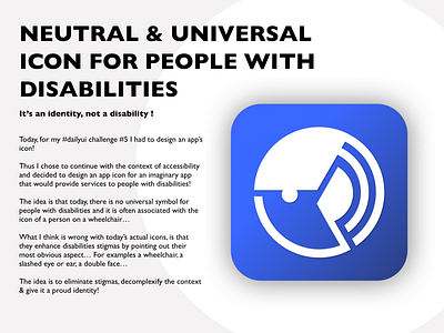
Thus I chose to continue with the context of accessibility and decided to design an app icon for an imaginary app that would provide services to people with disabilities!
The idea is that today, there is no universal symbol for people with disabilities and it is often associated with the icon of a person on a wheelchair…
What I think is wrong with today’s actual icons, is that they enhance disabilities stigmas by pointing out their most obvious aspect… For examples a wheelchair, a slashed eye or ear, a double face…
The idea is to eliminate stigmas, de-complexify the context & give it a proud identity!
You can read more here :
https://medium.com/@mauricematarwehbe_69016/my-take-on-redesigning-the-disableds-icon-3b59c5d0b71c
Some more context:
I decided to participate in the 100 days UI challenge with two objectives:
1- improve my UI
2- Advocate & promote accessibility & designing for a good cause & better world!
You can read my latest article on medium about the good practices on UX accessibility right here :
https://uxdesign.cc/how-to-design-digital-interfaces-with-every-disabilities-in-mind-19572579d7ef
Cheers!

