Checkout
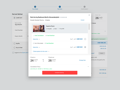
We set forth aiming to correct flow problems in the Redesign process. One of the pages that we meticulously focused on was the checkout page.
Even though the vast majority of users come to the checkout page, they still haven't decided to buy it yet.
Consequently the customers frequently returned to the previous page, to check the room type, facilities, cancellation policy and all other details repeatedly, and about 60% were leaving the site at this stage.
We tried to provide a stream where the user can view and change all the necessary details during the redesign process.
More by Ayşe Keskin View profile
Like
