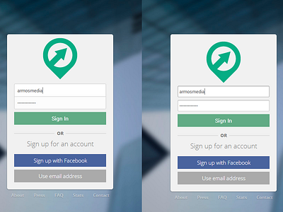
Dare To Compare - Sign In Dialog
Slowly but surely perfecting the sign in/registration form. I'm thinking of sticking with the left, although there's not too much of an active state (other than the background lightening from #f1f1f1 to #fff).
What do you guys think? It looks way better @2x, too.
More by Andrew Schmelyun View profile
Like
