"More minimalist effect" in the maximalist market!

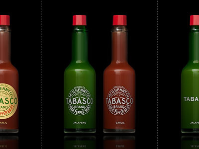
When we went to the supermarket in our last trip to London, we've noticed that, "Our packaging project could go to next level". This second edition has one more variation and now, we are showing all brand names with simple text & same font, without logo or corporate sign on it. The font is Helvetica Neu Bold. Our question is similar with the question in our first post!
What is your choice in these 4 different variations?
1. Original variation
2. Simple variation
3. More simple variation
4. No logo variation
More sample at A2591.com or Our Flickr Page