DailyUI #035 - Blog Post
Good' evening Dribbblers 👋
This is my #035 #DailyUI design.
Design Hint 💻
Design a blog post. Consider what's important- the content of course. Also consider the author, date, category, comments, layout, etc.
The Idea 💡
The idea for today’s UI design is a mobile blogging app for Android and iOS. The app will feature a 'home screen' to view blogs from following members and featured blogs, a 'profile screen' to view your own profile and edit it, and finally a 'community screen' where you can search for various blogs from the community and filter by authors etc. The design will consist of a 'dark mode' themed colour palette for easy viewing at anytime of the day, small iconography, various typography and photography.
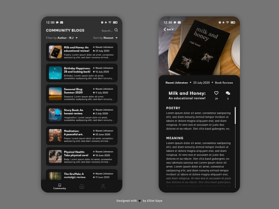
Final Thoughts 🧠
Again, I love it! Todays design focused on layout and spacing, it took some time individually spacing the elements out and coming up with a solid layout for both featured screens, but it was time well worth since I love what I ended up with. The 'dark mode' themed colour palette really makes the design pop in a sophisticated type of way and makes for a pleasant reading experience, at anytime of the day. The 'featured' blog image gives every blog a dash a life and entices the user more than just text on a screen. The bottom 'navbar' [LEFT] gives a simple and straightforward sense of overall app navigation followed by the simple 'back' button [RIGHT] and scroll-ability.
The text within a blog is the most important thing for the user (unless its an image-centric blog) to view, so I wanted to get this spot on. I used a well-known and solid font face called 'Roboto' for the paragraph text since it's one of, if not the easiest font faces to view on a mobile screen, with another font called 'Navigo' following for the titles and subtitles, to spruce up the design. The layout of the author, date and category within the blog screen [RIGHT] fits the screen really well and feels as if it belongs there, following the title and 'appreciations' and 'comments' iconography. The 'card' layout of the community screen makes for a simple scroll navigation and the way I have laid out each element within the cards themselves are very informational, modern yet seem to fit in with the simply sophisticated nature of the entire design theory.
Overall, it's been an enjoyable day of designing yet again, testing my ability to come up with solid information layouts and beautiful UI design elements; I love what I've designed today.
Unsplash photo credits 📷
@dollargill, @sincerelymedia, @ninjason, @federicorespini, @jareddrice, @kellysikkema, @szmigieldesign
Book credits 📚
"Milk and Honey" by Rupi Kaur, "The Gruffalo" by Julia Donaldson
Share the love, press "L" or "F" if you ❤️ my work!
As always, I welcome any feedback! 😄
- Elliot