M&W store
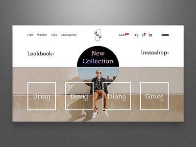
Don't you want to buy something in this store? This is my little fantasy about how the website of a major clothing brand should look like.
I combined a photo and a geometric shape to attract attention and create a seamless transition effect. At the bottom of the page are links to the latest collections of the brand.
Definitely this is a much cooler design than those that are now on the Internet.
More by Artyom View profile
Like
