Sonovision Logo - Rebranding
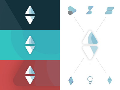
So recently I was looking at sonovision; with a very industrial logo, and with the vision to bring it out of that background into a more design agency and more contemporary feel, I decided to redesign it. This is not work for them and I do not work for them. Not sure if I am allowed to show the old logo side by side - but it wont be hard to find online.
On the left is the alternate palette and on the right is the final, surrounded by my main 6 other branches that I went down before getting to this one in the middle. I was greatly inspired by @Elenalazareska and her work for my final piece, to simplify my work and the introduction of the solid colour bands rather than the gradients.
