Awendan identity design

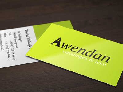
For a freelance translator in The Netherlands I designed the complete identity: Logo, typography, color palette, stationary and website.
She specializes in written translations, so I created an iconic capital A that looks like the tip of an ink pen, to accentuate the crafstmanship that goes into her work and the writing she does.
This was a quick turnaround project, nevertheless it was fun to do and the client was extremely pleased with the result.