HIPA Cloud Landingpage
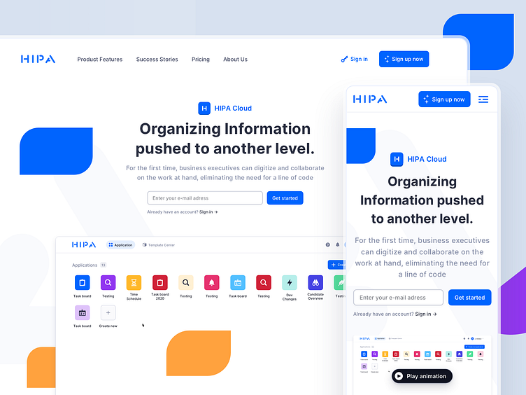


Hey, a few weeks ago I worked on a SaaS website and tool redesign – this is a small glimpse into the outcome.
The focus for the landingpage was to stand out and attract new users. That's why I decided to work a lot with engaging colors, interactive sections and graphical elements that provide a great look & feel but still don't take the clear structure of the website. More to come soon. What are your thoughts on this?
Are you looking to build a web or mobile application? We’re always looking to partner with great companies. Say hi at hello@fintory.com
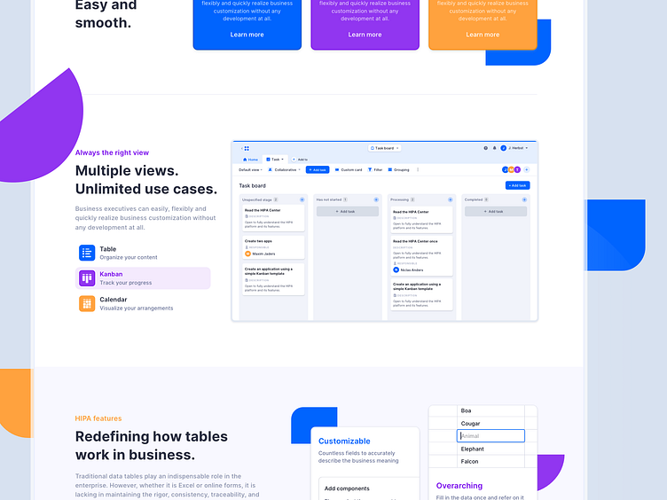