Your Personal Healthcare Provider Online
The team is available for new projects! Drop us a line: hello@purrweb.com | WhatsApp | Website
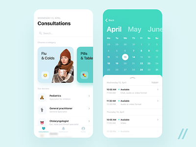
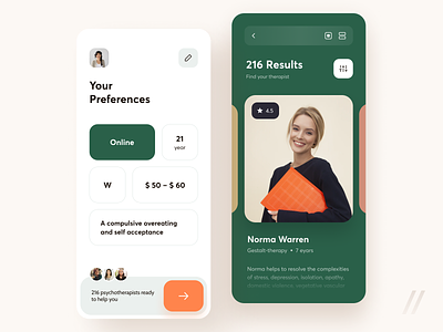
What’s up, guys? Check out the way we’ve designed a telehealth app. This one allows you to book appointments with a doctor and get detailed answers to health-related questions online.
What do you think of the overall design? Do the colors suit it?
📖 On the first shot, users see a list of available consultations. If users jump to the calendar, they’ll see a list of available appointments.
🗒 On the second shot, you see the notification center that keeps you updated on the latest news. Whether a doctor reschedules an appointment or is already waiting for you — you’ll receive a push notification.
🎨 The primary colors are turquoise with a slope of green. Why? Turquoise is typically associated with credibility, trust, and professionalism— all these qualities are valued in the medical community. Green, the color of life and energy, represents safety. Background is light to create a sense of cleanliness and sterility inherent in medicine.
🍃 The blurred footer and slight gradients make users experience even more delightful. Stay safe and enjoy the smoothness.
Created by Purrweb Team
Press L if you like this design and share feedback!
We share experience in designing interfaces for healthcare startups 🏥, give insights into developing an app for pet owners 🐈, and reveal the secrets of coming up with a competitor to famous services 🤩
Keep in touch and check out our recent news 💜


