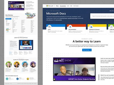
Microsoft Docs - Homepage
Hey folks –
So I was finally given some more visually focused design work for my day jam at Microsoft. We're working on defining some new design pitches for the Microsoft Docs homepage.
---
📝Mission:
“Consider how we may leverage the belief that Microsoft Docs helps people level up their career, not just solve problems?”
🙎♀️User goals:
“Finding reference material, seeing what has recently changed or updated about a product, getting started with a tool or product, evaluating a product for adoption, see what the community is saying about a product, or putting their knowledge into practice with hands-on learning opportunities.”
---
✅My goal with this phase of the process is to shake out the potential modules and content for the different areas of the page design.
In my own eyes, I wanna provide a welcome mat to our house, give visitors a tour of what they can do while on the site.
Major modules for this homepage (from top to bottom) include:
1. What is this place and what can I do here?
2. Support our business goals, provide a surface for storytelling.
3. Retain utility of existing directory, updated in the spirit of site browse.
4. A primary user goal was to be able to see what has recently changed or been updated.
5. What is the community saying?
6. Connected, related resource sites.


