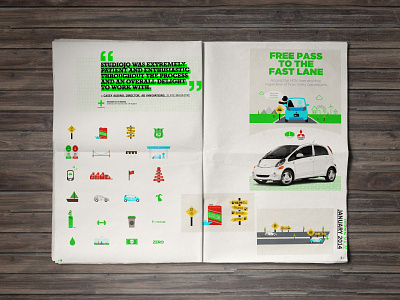
2014 // Mitsubishi Motors infographic layout
2014 // Mitsubishi Motors infographic layout
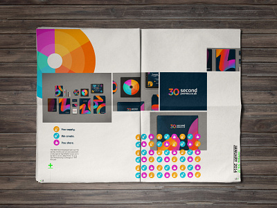
A sneak peek of my brand refresh and portfolio review layouts. (Newspaper mock up)
Hugely influenced from Swiss style design focusing on big typography, overlapping and a strong accent colour. Using the vibrant green and mono imagery for intro pages and full colour imagery for the visuals.
Follow the development here:
https://www.behance.net/JonathanQuintin/wip
Designed at STUDIOJQ©
More by MadeByStudioJQ View profile
Like

