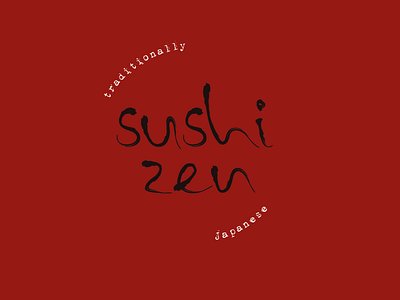
Logo Challenge: Sushi Zen
The second challenge of the 30-day challenge by Logocore, was to create a logo for a traditional Japanese restaurant, called Sushi Zen. I decided to design the logo using custom experimental typography with the help of an ink brush and my Wacom tablet. In my research I found that Japanese culture uses many different traditional patterns and decided to incorporate one of them in the branding, as a next step. Same Komon (Shark Skin) is the name of the pattern I used for this one. "This pattern is so named because of its overlapping arcs of small dots resemble shark skin. It was used by the Kishū Tokugawa family, to which Shōgun Tokugawa Yoshimune (1684–1751) belonged." source: https://www.nippon.com/en/
More by Laïkí Sofia View profile
Like

