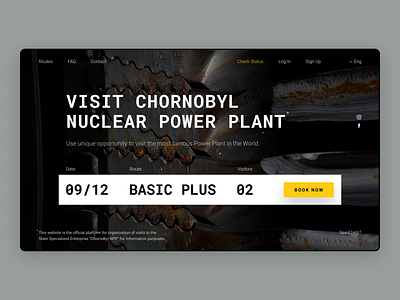
Visit ChNPP Redesign
Hey, Dribbblers 👋
This is my attempt to redesign the official website of the Chernobyl Nuclear Power Plant visiting service — https://visit.chnpp.gov.ua
T O P
In the upper part, you see the main menu of the website. The "Check Status" option is colored in yellow since it will be a popular option for those who already applied for the tour and want to see how things are going with documents, registration, etc.
C E N T E R
In the center part, you see the title that says that this website is used to book the tours inside the Chernobyl Nuclear Power Plant.
To the right from the title, there is a status bar that navigates the user through 5 background pictures that will be changing each other with time.
B O T T O M
At the bottom part, the is the main interaction point — the input form to pick the date, the route, and the number of people in the group.
Big thanks for the photos to SSE Chornobyl NPP / https://instagram.com/chornobylnpp
Fonts — Roboto Mono + Roboto.
Please feel free to leave a comment and press "L" if you like this shot.
