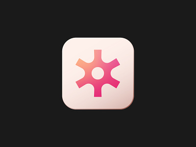
Neurono - App Icon Logo Design
Getting close-up today with Neurono's logo design and new app icon.
I don't often create faux buttons and icons like this but, I couldn't resist for Neurono.
The warm punchy gradients and muted colour scheme contrasted each other so well. It was easy to make it jump off the screen at you!
One of the smallest places any startup is going to have their logo placed is an app icon. So it's always worth testing it out before committing to colours or creative direction.
This logo is available for purchase.
Interested in working together or purchasing this logo design? Email: hello@connorfowler.com
More by Connor Fowler View profile
Like

