Verivox
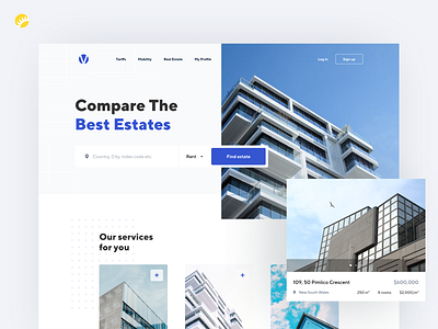
Verivox is a relatively big local comparison shopping website, that came up with the idea of international expansion. Their main feature is comparing different goods like mobile devices, cars, or auto parts, as well as real estate and even loans and some other services.
Quite popular among locals, the site, however, wasn’t fit to expand to the foreign markets without significant changes… At least, it was so before. Providing a complex UX-research allowed our designers to create a lightweight and easy-understandable UI, ideally fitting to the target audience. The high points of this project became the large headers, the combination of small and big letterings, and the indicative icons - all of these helped to emphasize the required details.
---
Press "L" if you like it :)
Want to see more projects? Visit our Team and remember Andersen ;)
