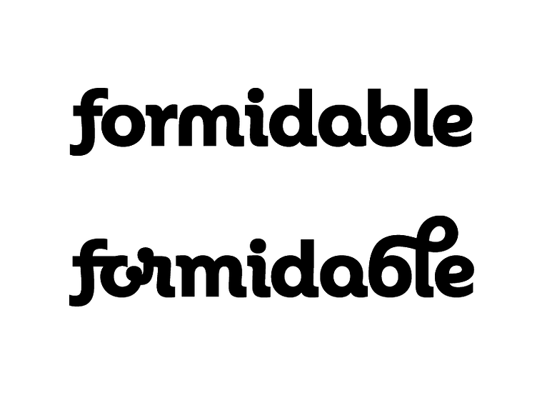
Formidable Lettering
I'm lettering a logo for a night club brand. Together with the client and the design team we chose a geometric italic style. It is contemporary and fluid and everyone agreed it would suit the brand.
The m in the upper word does not have an entry stroke, in order to allow the r to be kerned close for good spacing. That is the fun of lettering – you can do a lot of tricks.
I'm thinking maybe a typeface in this style, to include a lot of quirky ligatures and alternate characters would be a good idea for the future.
More by Sebastian Boros View profile
Like
