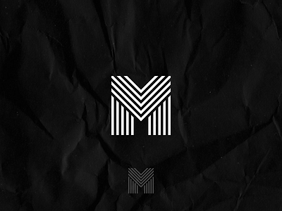
M Line Letter Mark Logo Design Concept
M Letter Mark Concept I created as part of an undisclosed project I'll be showing off later this week!
The idea behind this mark was to fit in with a music theme, which was a consistent theme throughout all of the designs I created. Matt, who the project was for, did not want a generic design like a music note. We needed to come together to create something out of the box.
An initial idea which he had was to incorporate the stave lines of a composition sheet uniquely. In total, there are five lines, and I used these lines to form the M for the concept fitting in perfectly with the idea he had, while still being a structured and legible mark.
Thank you for viewing my work 💙
Want to work with me?
Drop me an email at contact@penna.design
Or visit my online portfolio here penna.design
