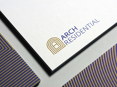
Arch Residential logo and stationery design
Arch Residential approached me to help them create a stronger and more memorable visual identity to support them in their business expansion on the London and UK market.
As the main constitutive logo element I created an iconic symbol from the first letter of the company name.
I have decided to create a spiral around the letter to enhance the territory expansion concept but also to create a structural and architectural depth, enriching the arching construction. I have also been inspired by some labyrinth garden shapes and by the crescent London streets shape, known as some of the most wealthy London streets, Egerton Crescent and Pelham crescent being the two main ones, both with terraced houses and sharing a communal garden.
Business cards, compliment slip and letterhead have been printed on the GF Smith Smooth Colorplan Digital White paper range using a dark blue and a metallic bronze solid Pantone ink to make sure that all the graphical elements and texts remain extremely sharp even if printed in a really small size.
Regarding the typography, I decided to use Fedra Sans and Fedra Serif A fonts family. It is really important for me to use a serif font to enhance the body text legibility and to keep the sans-serif for the logo, headlines, titles, subtitles and abstract texts. A consistent font family is the best tool to be able to generate harmony as much as distinction and contrast. Fedra Sans was designed in 2001 and Fedra Serif in 2003 by Peter Biľak.
