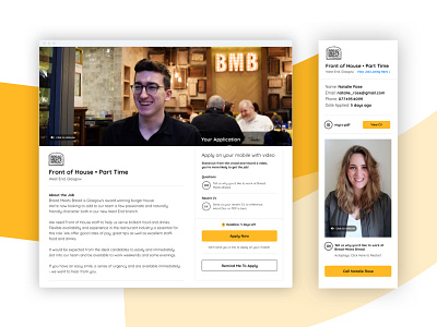
Apply for jobs with video 🟡
Let's talk about using yellow in user interface design: put simply it's hard to do well. I see so many examples where the contrast is not there and the content is just not accessible or legible.
What do you think of how I've handled this?
This project was for a startup called VOB - a web app that makes it easy to apply for jobs with video.
We worked on specific features to help direct users to apply from their phone with video. This included sending job applications to a mobile device from a desktop and also a 'Remind Me to Apply' interaction.
More by Jamie Sunderland View profile
Like
