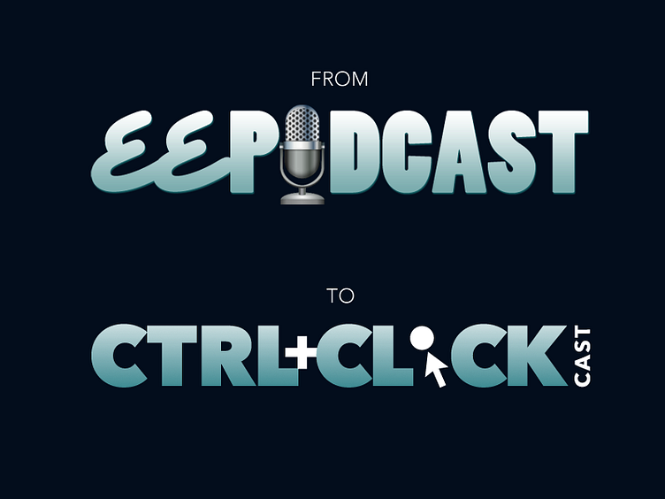
EE Podcast to CTRL+CLICK Logo Refresh
I quite adore the original logo I designed for EE Podcast (with the microphone illustration by Jason Nakai), but when we decided to expand our show subjects, we wanted to maintain similarities in the look and feel (to convey that hey, the quality is still the same and to keep things familiar), but we also wanted something NEW and MODERN to reflect the direction we were going. We chose something very simple and graphic. Cleaner and pared down compared to the retro-styling I went for in the original look.
More by Lea Alcantara View profile
Like
