Demara Band Logo
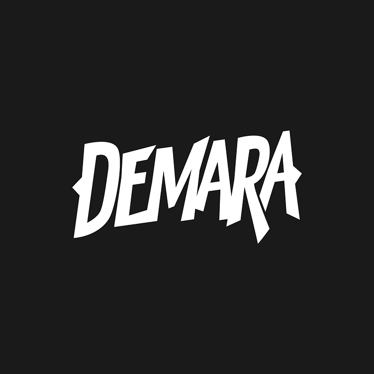
My primary goal was to come up with something for my band that felt a little raw. All of my design work is sort of cute and polished for my day job. I struggle to create things outside of that setting.
These letters are "hand drawn" in that I used the pen tool freehand. I tried to set an upward angle of 8 degrees and then strategically break it at times.
This update gets the crossbars of the As on the same angles and redraws and aligns the arrows on the outside. I also did a little bit of light cleanup on the last A.