Reworked discussions
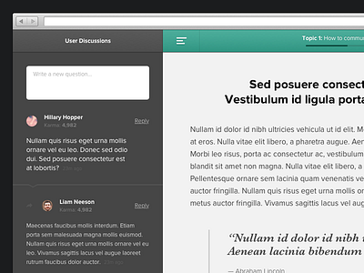
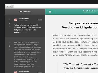
I reworked some of the UI from the previous shot, making it less cluttered and cleaner. If you check out the attachment, the idea behind the "Reply" feature is simple - basically when you click 'Reply' the background of that comment pops out (the dark section) and then the reply field appears. The 'Reply' text then turns to 'Cancel' if you decide not to reply.
The bigger font size at the top is (http://cl.ly/TPuh) is to indicate that this is the Question and the ones below it are the replies/comments.
More by James View profile
Services by James
Like


