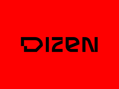
Dizen
Dizen is a newly established company in Georgia that offers customers the highest quality furniture, accessories and interior materials (eg wallpapers, wallpaper, etc.), all that is needed for home furnishing and decoration. Because Dizen is focused on quality and design and to its costumers, and these two components are an integral part of a comfortable life. BRID worked on Dizen's Naming, Logo and Branding. Dizen comes from the English word meaning to emphasize, arrange and beautify individualism. As Dizen plans to establish a place on the international market, we have tried to keep its name sound simple and consistent with its work. The typographical logo has strong and at the same time simple shapes. In the Dizen branding, the red line is a key element of the design. This is an artistic representation of the direction which this company gives to its customers. As for the color of the branding, it is an intense red, which indicates the company's strength and vigor.

